All work
Microsoft To Do logo

04 / Selected work

ToDo Apple Watch App

Bringing Microsoft To Do to the wrist: quick capture and a glanceable view of your tasks, anywhere and at any time.

  • Microsoft To Do
  • watchOS
  • MAU: 100K+
  • First foray into wearables
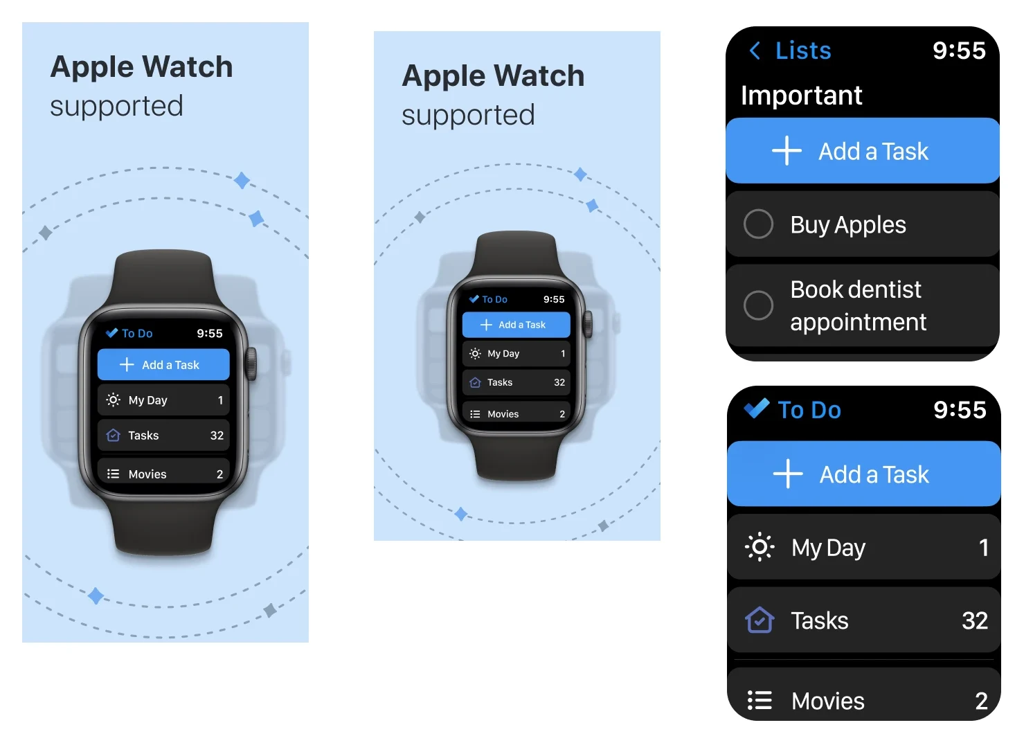
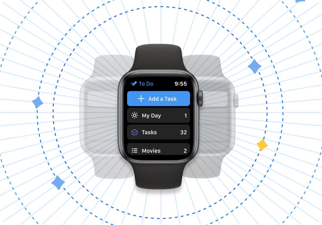
To Do on an Apple Watch showing Add a Task, My Day, Tasks and Movies, with the watch repeated softly behind it inside blue dashed circles

01 / Context

Context

The brief

Integrate To Do with Apple Watch so users can access their tasks anywhere and at any time.

It will be To Do’s first foray into the wearables market, serving as a good benchmark and proof of concept for the future. It will not be a standalone app, and it will require the user to have an iPhone.

Top 3 asks on Apple OCV, comprising ~11.2% of all feature requests. On Feedback Portal, one of the top 15 most requested features, with ~2,200 upvotes.

Who are the Apple Watch users?

100M+people worldwide use an Apple Watch
Mostusers wear a smart watch to track their workout

Tech savvy

  • Early adopters. Generally enthusiastic and tech oriented.
  • People who have an iPhone and are bound to the Apple ecosystem.

Tech savvy youngsters / students

  • Customers aged between 20 and 45.
  • Potential Apple Watch buyers are at their final years of college, newly married, or have a family with children.
  • These customers are also expected to be high earners and can afford the latest versions of the gadget.

Planners / the do-ers

  • People who love to plan their lives and schedule their days.
  • People who believe in living a healthy and rich lifestyle.

Status symbol

  • They who don’t really care what is in the watch but buy and use it anyway, for the basic functionalities of a watch.

Fitness enthusiasts

  • The Hermes version of the Apple Watch is targeted at customers who care about designer accessories, while the collaboration with Nike is intended for clients that are fitness-oriented.
  • The Apple Watch has a great appeal across all genders, age groups and social statuses, as it doubles up as a fitness tracker with Apple’s Fitness+ services.


02 / Scenarios

Scenarios

Scenario 1

Illustration of Ninad

User: Ninad, 28

Ninad is a working bachelor. Weekly grocery shopper, believes in healthy eating and cooks his own meals. He religiously follows strict diet routines. He has a grocery list for every week.

User actions
Emotions
Pain points
Opportunity areas
Step 1

Ninad goes to a supermarket for his weekly grocery shopping

Step 2

Opens his grocery list in To Do

To Do grocery list helps him to shop efficiently

  • Task management
  • Planning
Step 3

Visits every section and fills his shopping cart with items from the list

Step 4

The bag in his right hand gets a little heavy

Difficult to multitask: when your hands are occupied

  • Voice control
  • Hand gesture
  • MVP designs
Step 5

Ninad has to open his phone multiple times to check his grocery To Do list

No way to quick view his list. Ninad finds it difficult to manage his heavy bag in one hand and check his mobile phone with his other, less dominant hand

Step 6

Have to unlock phone, open To Do, then open the grocery list view

  • Quick capture
  • Glancability
:):/:(

03 / Jobs to be done

Jobs to be done

JTBDs

  • Users should be able to add their task quickly: voice and manually.
  • When users are in a hurry, they should be able to quick capture into their existing list.
  • User should be able to view the meta data information of their task.
  • User should be able to complete their tasks in a list.
  • User should be able to link their To Do account in the watch.
  • HMW reduce distraction and bring focus to the user?
  • HMW reduce user frustration and anxiety due to interruptions?

The jobs to be done

  • A quick way to access lists while the phone is away
  • A quick way to create a new task
  • Customisation options
  • Quick view / distraction-free environment
  • Onboarding / To Do visibility on watchOS

04 / Needs & principles

Needs & principles

User needs & success metrics

User needs, Apple Watch

  • Quick consume, view and capture
  • Quick action and creation: complete a task, add a task
  • Less distractions
  • Simplified IA
  • Voice control:
    • “Hey Siri, open my To Do list”
    • “Hey Siri, what do I have on my My Day today?”
    • “Hey Siri, add my task: water plants”
  • Reminder notifications

Success metrics

Telemetry

  • # of users on Apple Watch
  • # of lists created through Watch
  • # of tasks created through Watch
  • # of tasks completed through Watch
  • # of lists opened
  • # of tasks opened
  • % of notifications opened

~0.24M users will use the Watch, 10% of MEU.

How will we define our success? With the number of users creating tasks, or by the number of users downloading the app on watchOS?

05 / Compete

Compete

Existing apps in watchOS

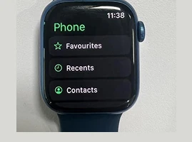
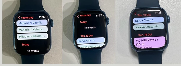
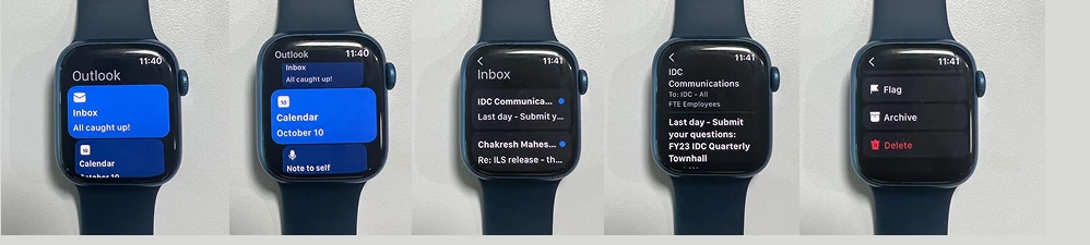
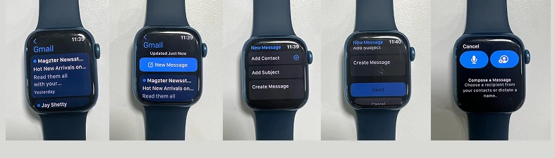
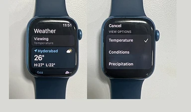
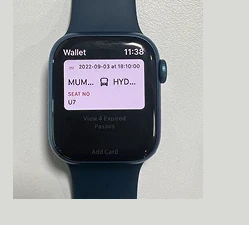
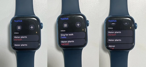
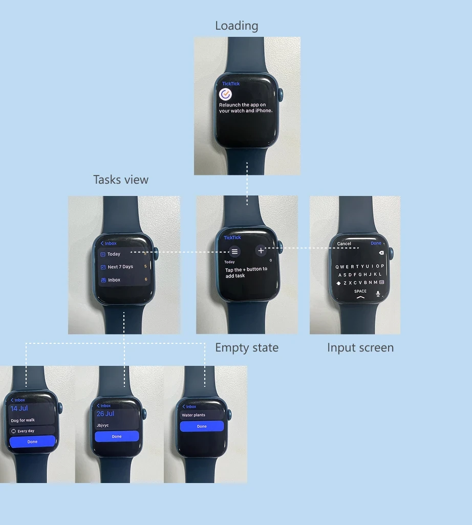
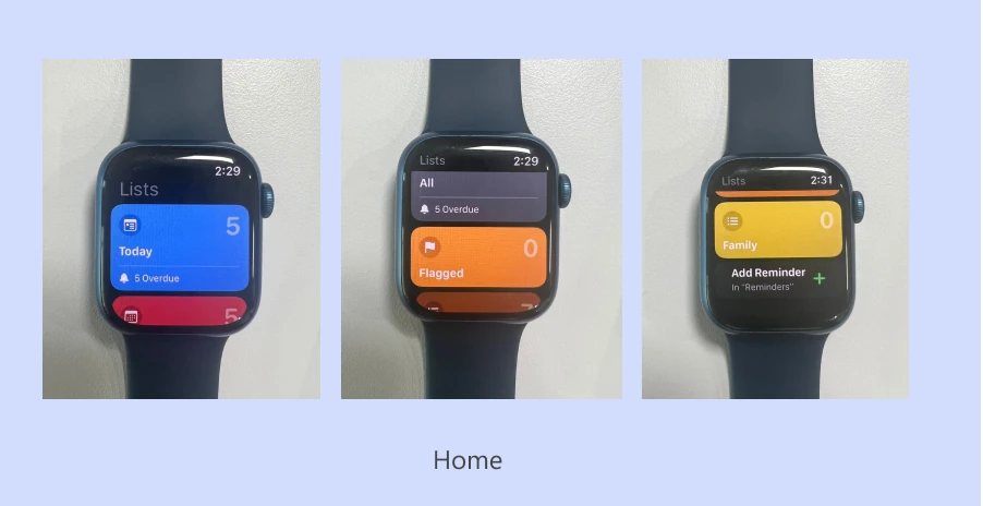
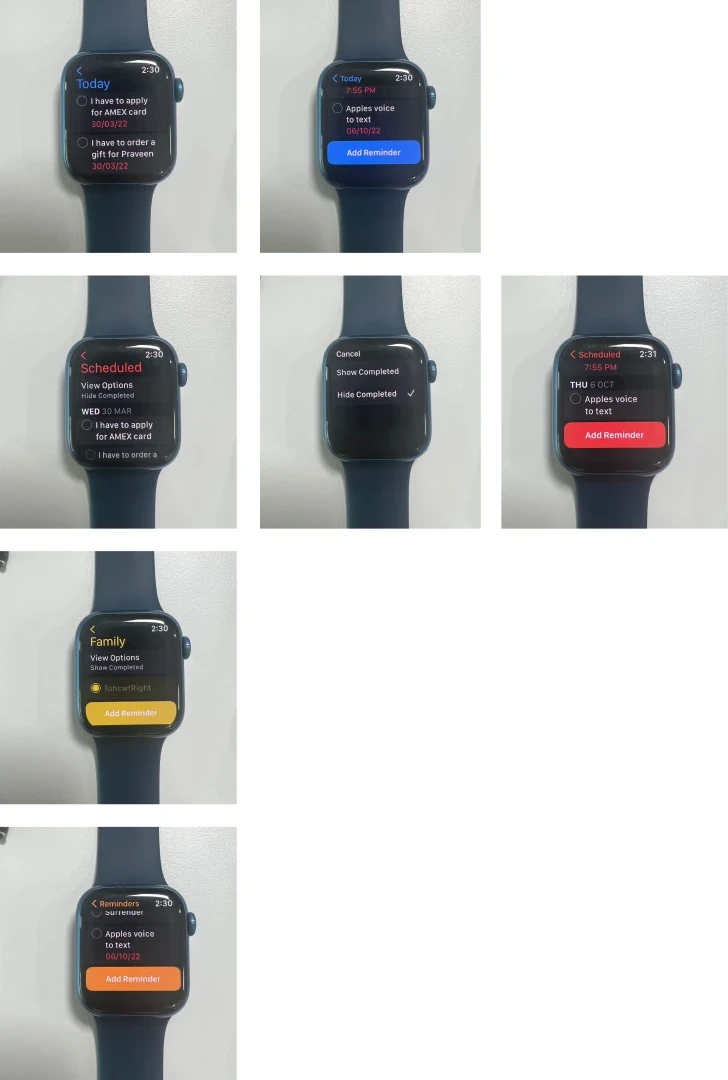
Calendar, Outlook, Gmail, Phone, Weather and Wallet on Apple Watch.

Phone app on Apple Watch showing Favourites, Recents and Contacts
Phone
Calendar app on Apple Watch, three screens
Calendar
Outlook app on Apple Watch, several screens
Outlook
Gmail app on Apple Watch, several screens
Gmail
Weather app on Apple Watch with a view options screen
Weather
Wallet app on Apple Watch showing a boarding pass
Wallet

06 / Explorations: mocks

Explorations: mocks

Information architecture

The two jobs, view and capture, and what sits under each.

1. View
Lists viewView optionsShow Important · Show Planned · Show All · Show Completed · Show Flagged…
Tasks viewView optionsShow completed · Show task details
2. Capture
Hey SiriAdd taskAdd list

07 / Final design

Final design

Lists view

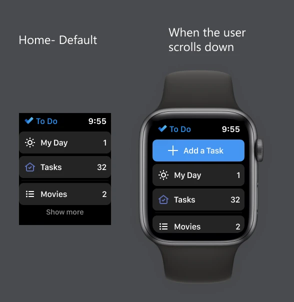
Final design: Home screen

Home screen

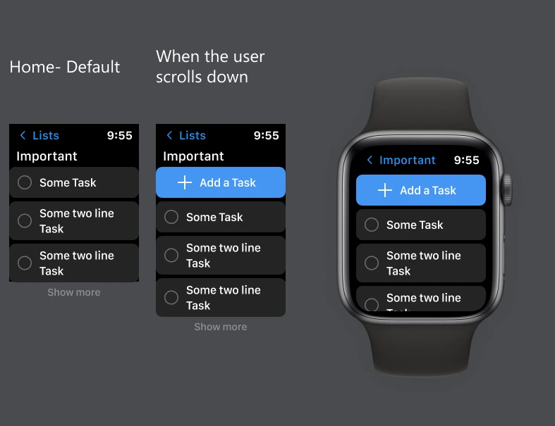
  • Give only My Day and Tasks as the first entry view.
  • Have add task CTA on top, which comes up when the user scrolls down.
  • Show 2–3 user created lists and a show more option.
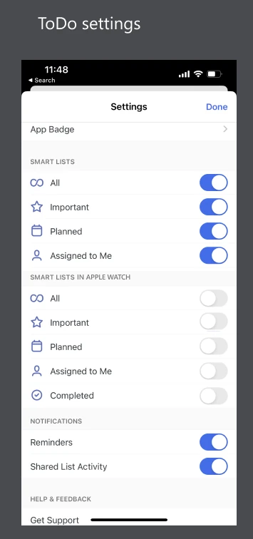
  • View options in the To Do mobile settings page: let the user decide if they want all the smart lists or not.
Final home screen designs on Apple Watch, default and scrolled
To Do mobile settings page with Apple Watch smart list toggles

08 / Our hypothesis

Our hypothesis

Our hypothesis

Home screen

  • What, according to you, adds more value on the homescreen of the Apple Watch: add task, or add list?
  • Should we have add tasks on the homepage? How relevant is add list on the homepage?
  • Having both add task and add list on the homescreen, do we need it or not? Is it confusing the user or helping the user?
  • Placement: in the bottom or top?
  • Can we only have add task and nothing else?

Meta data / details

  • Would users need the entire meta data information, or is only the due date enough?

Intent

  • When our users come to To Do on watchOS, what are they going to use it for? Quick capturing and task creation, or consuming and viewing?
  • What do users prefer more on Apple Watch: creating tasks, or viewing tasks?

09 / Enter research

Enter research

Research objective, hypothesis & plan

Research objective

Understanding the user’s context and usage pattern of their Apple Watch in general, and with respect to To Do on Apple Watch. With research we hope to validate our hypotheses around IA and watch screens:

  1. View vs capture
  2. Meta data information on the task chip
  3. Watch view options on the mobile phone

Hypotheses

  1. Users should be able to quick capture and add a task from the homescreen (lists view) on the watch. View smart lists, My Day and Tasks, along with 2–3 user created lists by default. Show more should expand the list.
  2. Due date is the only essential information in the meta data that should be on the task chip on the watch.
  3. Provide watch customisation and view options (show meta data, completed, other smart lists) on the mobile phone To Do settings, not on the watch, giving the user the freedom to select the lists they want on their watch.

Type of research

Guerrilla research. Dipstick study.

  1. 1:1 interview
  2. Observation session, where participants test the UI and interact with the screens (if required)

User segment

~8–10 users. Criteria: non-TE, Tasks Everywhere members.

  • P0 To Do users + Apple Watch users
  • P1 To Do users + any smart watch users
  • P2 Apple Watch users
  • P3 Any smart watch users

10 / Solutions

Solutions

Solutions

1

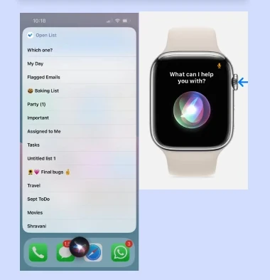
Voice input

Have voice input for quick capturing from Apple Watch, even before entering To Do.

“Hey Siri, add tasks, show lists”

Siri on Apple Watch asking what can I help you with, next to a To Do list on iPhone
2

UI: lists view & tasks view

Lists view

  • Give only My Day and Tasks as the first entry view.
  • Add task CTA on top that comes up when the user scrolls down.
  • Show 1 user created list and a show more option. The latest list should be on top.
  • View options in the To Do mobile settings page: let the user decide if they want all the smart lists or not.

Tasks view

  • Add Task CTA on top. Completed tasks collapsed.
  • Task to mark as complete.
  • Settings to show/hide details and completed.
3

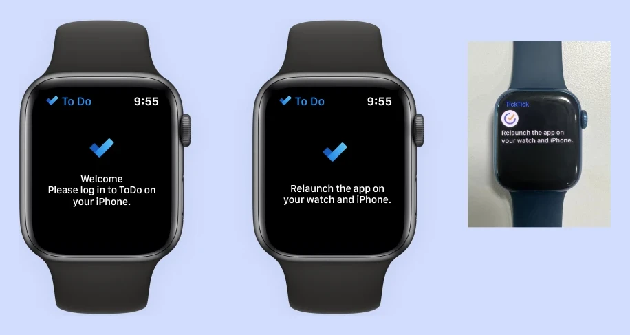
Sign-in screen

If the user is signed out on the mobile phone, show this screen to sign in from the phone.

4

Delight factors

Sound + vibration.

Confetti.

5

Apple Watch view options in mobile Settings

On the To Do mobile phone settings, show/hide: smart lists, completed, task details.

6

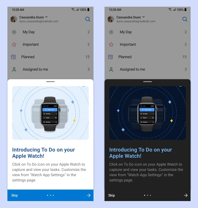
Onboarding / what’s new on mobile

Inform the user about our presence on the watch.

Also show “Hey Siri, add tasks”.

11 / Launch

Launch

Sign-out page

Final / approved copy
  1. Welcome screen.
  2. If the user is signed out, we give them the information to relaunch or log in.

“Please log in to To Do on your iPhone.”

“Relaunch the app on your watch and iPhone.”

Sign-out screens on Apple Watch: please log in to To Do on your iPhone, and relaunch the app on your watch and iPhone